
Nomina Brand Guidelines

LOGO
Our symbol and core visual identifiers.
01.1
symbol
The Nomina symbol one of our core identifiers. It is the primary visual form in which our brand is represented. It is employed to quickly communicate our identity to the world.

01.2
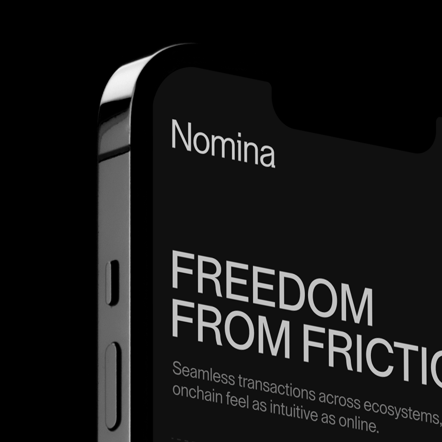
Logotype
Built to be modern and clean, our logotype
is a vital part of brand recognition. It has been carefully constructed to ensure it works at all scales, across print and digital touchpoints.

01.3
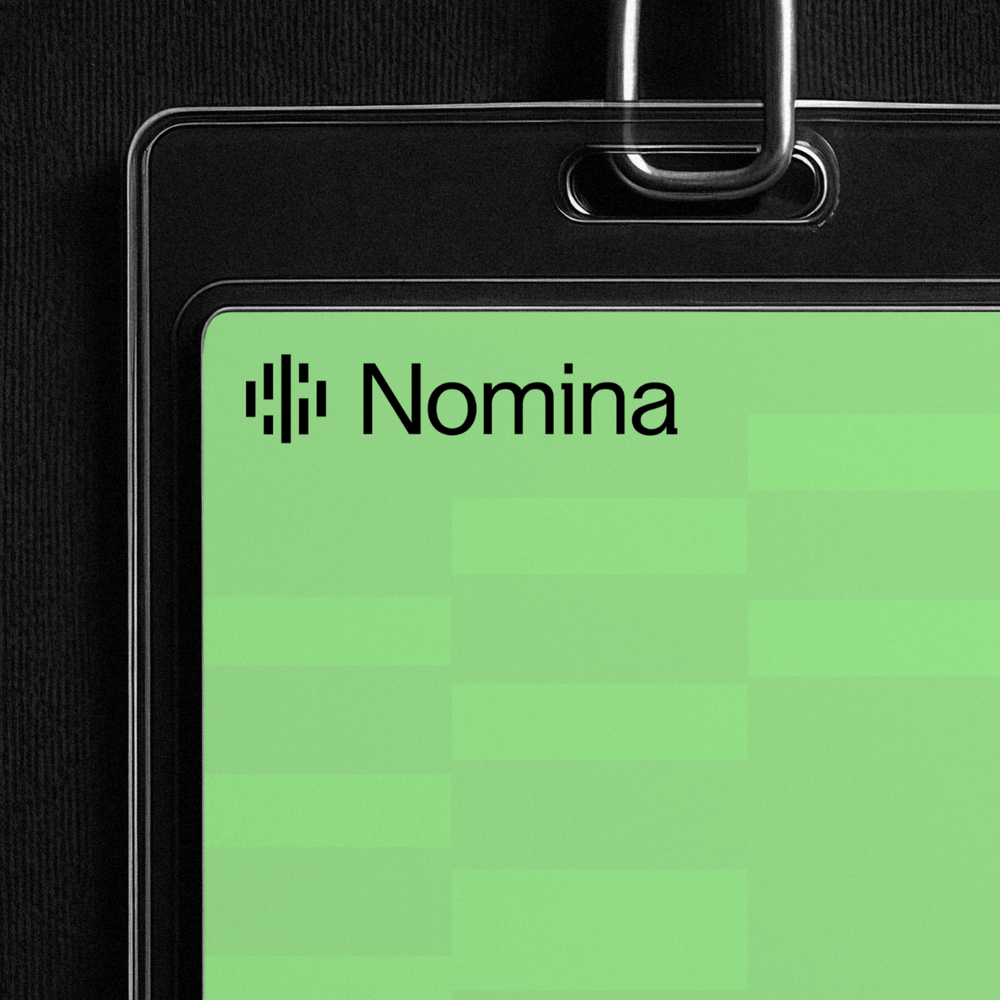
combination mark
The symbol and logotype are often used together for maximum brand volume.
01.4
clear space
Clear space ensures there is enough padding to maintain visibility and legibility at all scales. This is necessary for both the logotype and the combination mark.
01.5
scaling
Our logo has been crafted to read well, even at small sizes. There is no upper scale limit. When height is 40px or below, use the small scale version. If legibility is an issue, it’s too small.

01.6
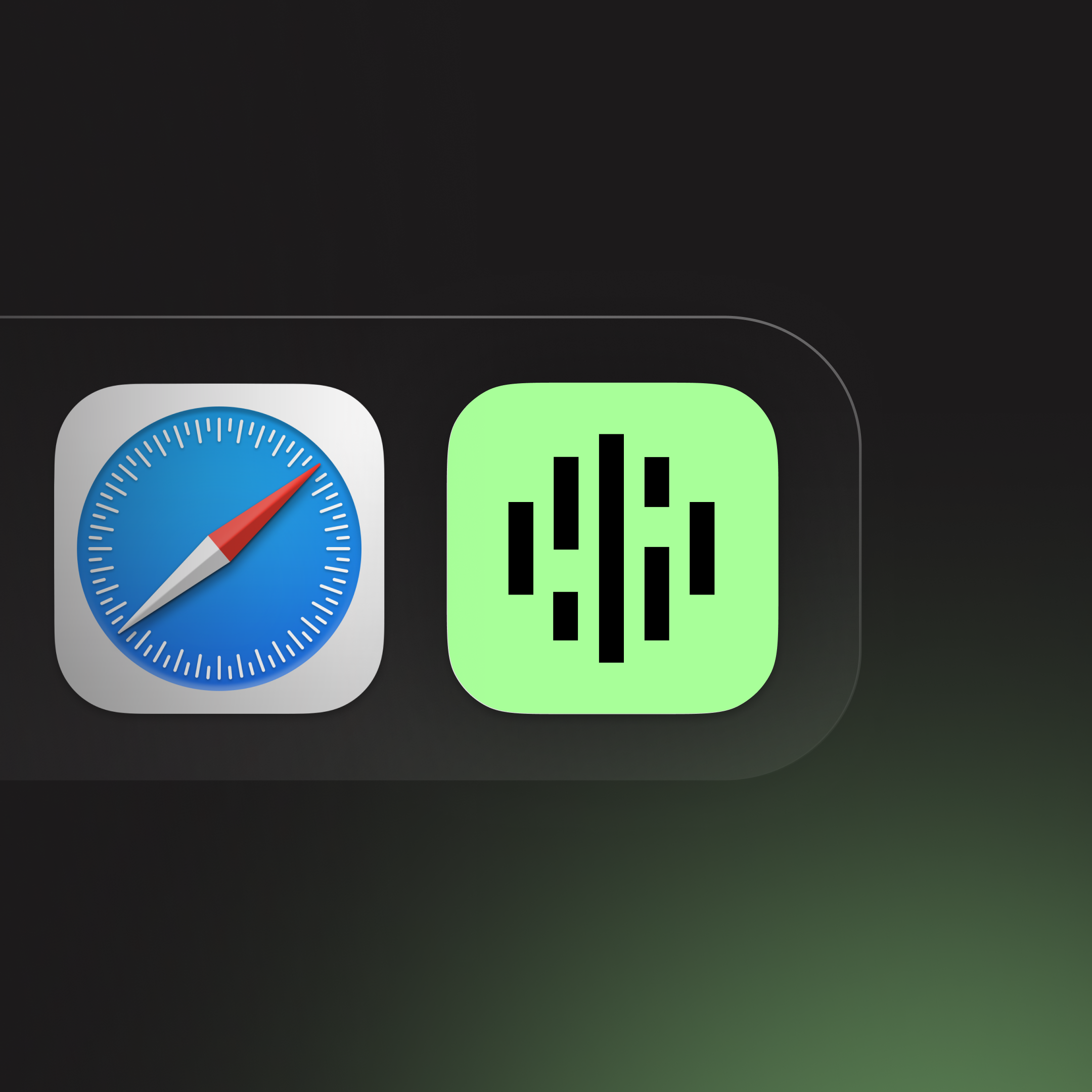
usage
Examples of logo usage are as follows.

01.7
resources
Download individual files below.


PNG
SVG

PNG
SVG


PNG
SVG

PNG
SVG

PNG
SVG

PNG
SVG

PNG
SVG

PNG
SVG

PNG
SVG
