
Nomina Brand Guidelines


04.1
patterns
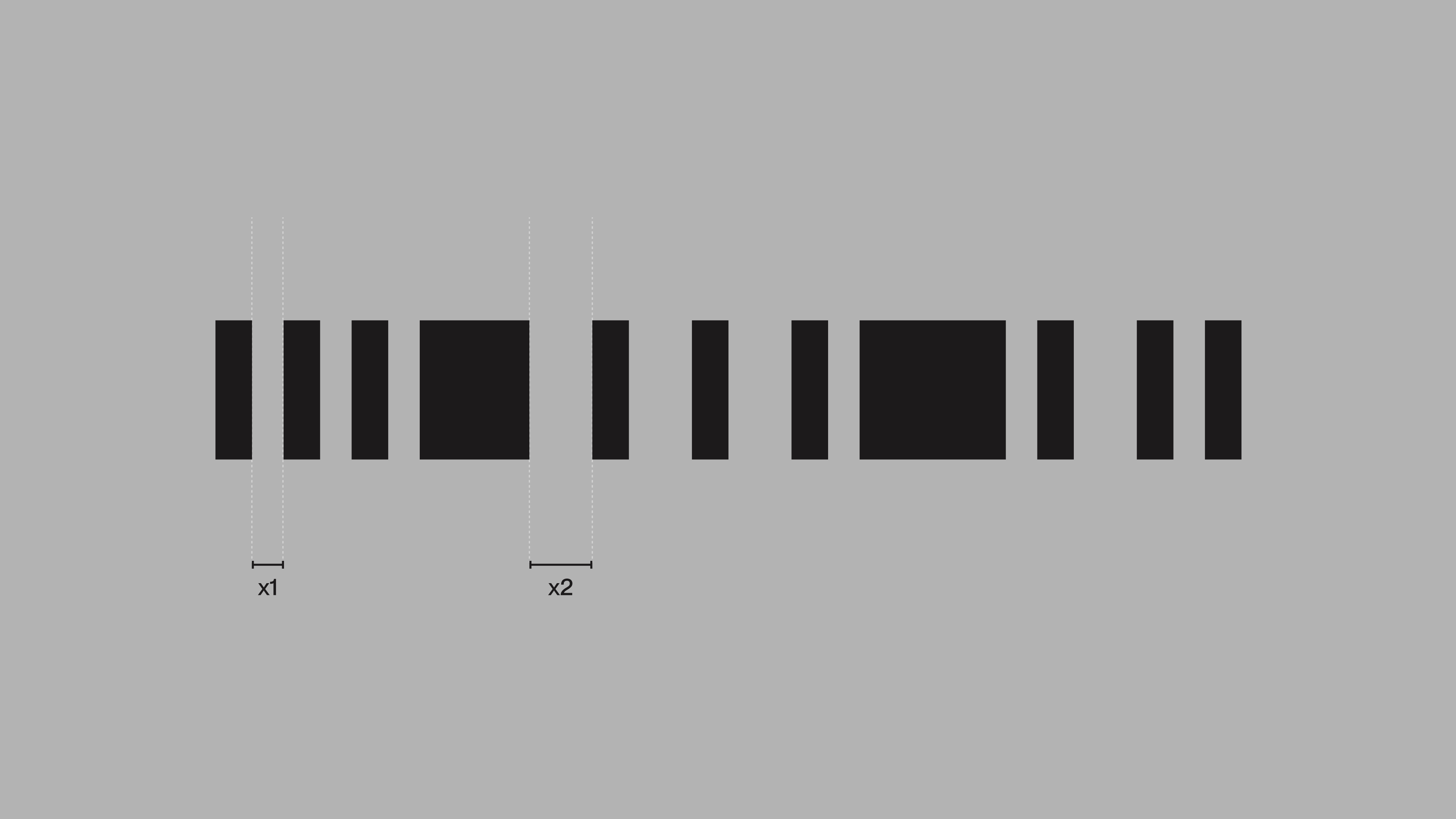
The illustration system originates from the core proportions of the symbol. Each bar, its spacing, and its scale form the foundation. From this structure, modular compositions expand into patterns, motion behaviors, and illustrations. By rooting the system in the logo’s geometry, every extension remains consistent, precise, and unmistakable.
04.2
illustrations
The illustration system is designed to balance recognition with atmosphere. The system builds depth using three tonal values layered together, so the subject is still understood while carrying the softer impression of candles and fleeting moments. This quality comes from how the grid is tuned: columns and rows determine density, while the thickness and length of rectangles set rhythm and intensity.
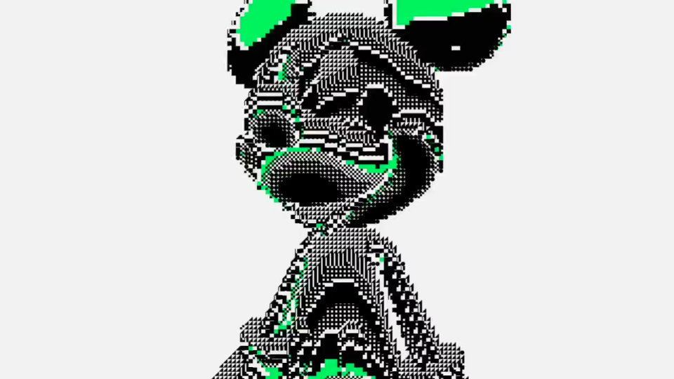
Shorter, lighter strokes keep the output airy, while longer, heavier strokes give it weight. The aim is not a literal copy of the input, but an interpretation where the figure is present, yet abstracted into layered tones and shifting rhythm.
04.3
iconography
Icons are built on a 32×32px grid, using the same proportional logic as the wider system. The forms are minimal, geometric, and consistent, ensuring clarity at small sizes and cohesion across applications.
